recalcula.ai
A conversational way to calculate, pay, and track capital-gains tax on the Brazilian stock market
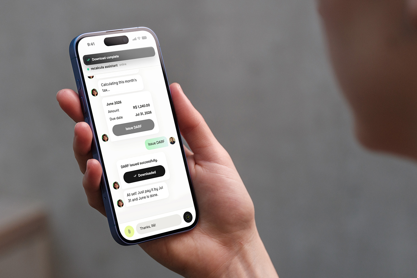
Brazilian law asks every stock market investor to be their own accountant: read the broker's note, do the math, file the right form, on time, every month.

01The problem
Ten manual steps stand between a trade and a paid tax bill.
Anyone who sells stocks, ETFs, or REITs on B3, Brazil's stock exchange, owes capital-gains tax on the profit, and the law leaves nearly all of the work to the investor. Every month with a sale, you open the broker's note, work out the gain or loss trade by trade, and adjust your cost basis for any corporate event that happened along the way, a split, a reverse split, a bonus share issue, a spin-off, none of which announce themselves, they just silently change the number you should be using. There's a R$20,000 exemption, but it applies to total monthly sales, not profit, so it doesn't work the way most people assume. Losses carry forward, but only within the same category, a day-trade loss can't quietly offset a swing-trade gain. Then you apply the right rate, 15% for swing trade, 20% for day trade, generate the DARF, and pay it by the last business day of the following month.
I started by studying an existing reference tool, a legacy, desktop-era product built for accountants, reading its manuals against real broker notes and the tax law itself. It was built for someone who already understands the rules and just needs a calculator. My users don't. They needed something that understands the law for them, and can say why a number is what it is. That reframe, from calculator to translator, became the thesis behind every decision that followed.
The cost of putting it off
Don't feed the lion. Late tax grows every day. While a DARF goes unpaid, the debt to Receita grows on its own, straight from the product's own copy. Two charges stack on top of the tax:
Adds 0.33% of the tax for every business day late. A few idle weeks already add up to several percent more.
Accumulated Selic-rate interest lands on top of the tax, with no limit. The longer it goes, the more the bill grows.
Staying current is cheap. Being late charges you every day.
02The solution
Two front doors to the same engine, and I didn't pick one.
Early on I had to choose between two mental models for the whole product: a dashboard you navigate, or a conversation you have. I didn't choose, I built both, deliberately, as two layers over the same underlying tax engine. The structured layer is a traditional app, monthly statements, a portfolio view, DARF issuance, corporate-action review, for the investor who trusts a number more once it's laid out in a table. The conversational layer is a chat with a persona, Rê, where every one of those same actions, sending a note, hiring a month, generating or closing a DARF, marking one paid, also exists as a message you can send her, answered with the same UI inside the chat: drop zones, progress bars, DARF cards with status pills. The landing page pitches it directly: forget the menu, talk to Rê.
A deterministic assistant, on purpose
Rê is intentionally not a language model. User intent is matched against a configurable set of trigger phrases, accent-insensitive, and the actual state comes from server-computed logic, not from anything generative. I made that call because the transactional path touches money and tax outcomes: I wanted it testable, predictable, and debuggable like any other feature, never a black box that might improvise a wrong answer. The trigger phrases and the in-chat help menu are editable by an admin without a deploy, so the script can evolve without touching code.
The pulsar
The upload itself needed one moment that felt distinctly the product's own rather than another SaaS drop zone, and it needed to double as a functional element rather than pure decoration. That became the pulsar: a radial lime core that breathes, compressing and expanding on a slow cycle, while two rings continuously emit outward from its center. It sits in the marketing hero with Rê layered over it, and it's also the real drag-and-drop target for uploading a note anywhere in the logged-in app. The breathing and the rings run on independent, coprime-length cycles so the motion never visibly loops in sync, and it starts mid-cycle on load so it never looks like it just switched on. Drag a file over it and the pulse pauses and grows; drop it, and the same glow reshapes into a real upload progress ring. The brand's signature gesture and the product's most important functional target are the same object, on purpose.

A standing invitation to keep talking to Rê rides along in the corner of every screen, so stepping from a report back to a question never means starting over.
03Two deliverables, not one
I also designed the landing page, a different job from the product itself.

Alongside the system, I designed and built the public landing page, a genuinely separate deliverable with a separate objective. The system's job is to actually run the calculation and keep someone compliant; the landing page's job is to make a legally intimidating product feel approachable in the first five seconds and turn a visitor into a signup. The headline is a single sentence a non-expert can act on: "You send the notes. We calculate and you stay compliant." A three-step explainer, send, we calculate, you're compliant, sets expectations before anything else, and real product screenshots, not illustrations, back up the promise in a "behind the product" section, with one honest exception: an evolution chart there is an illustrative SVG rather than live data, flagged as such in the code rather than passed off as a screenshot.
A section literally titled "Don't feed the lion" translates the abstract cost of missing a deadline into concrete numbers, the daily fine and the uncapped interest, using a light, punny tone to carry a genuinely serious warning without becoming alarmist. A closing section for power users makes clear that choosing the conversational path doesn't mean losing the data, the portfolio, history, and status views are still there for anyone who wants them. It has no visible pricing and no social proof yet, a deliberate sequencing choice this early, not an oversight, and the first thing I'd add once there's real volume to show.

04Where I used real AI
One assistant that improvises, kept far away from anything that touches a tax bill.
Support and general questions, how the exemption works, what the pricing is, how to read a DARF, are handled by a separate system: a Chatwoot widget backed by a real LLM (Claude). It's the one place in the product where I wanted generative flexibility, since support questions are open-ended in a way the transactional chat isn't. But I built it with guardrails I could point to, not just trust in the model's judgment. It only answers from a maintained knowledge base and never invents a price, a rule, or a feature. User messages are treated as data, never as instructions, with an explicit anti-prompt-injection rule written into its own system prompt. It never asks for or sees a password, a token, or a user's actual tax figures, that entire domain stays on the deterministic side. And a fixed list of topics, billing, a calculation error, account deletion, or a plain request for a human, always escalates, the model ending its own reply with a hidden marker the backend detects and strips to route the conversation to a person. I'd rather a support bot say "let me get someone" than have any generative system anywhere near a number someone might pay based on.
05Designing for anxiety
A few screens got disproportionate attention, because that's where trust is won or lost.
Email verification became four boxes and a code instead of a link to click, shown with a countdown, a resend cooldown, a visible attempt limit, and an explicit way to say "I got my email wrong" that clears the pending signup instead of leaving someone stuck on a typo with no way out.
The one screen I let block someone is the initial position setup, asked once, right after signup: did you already own stocks or carry losses before your first note? It's the single deliberate gate in the app, because skipping it doesn't just leave something incomplete, it silently produces a wrong tax number. The copy says so directly.
Nothing explains itself less than a blank result, so when there's no DARF to pay, a dedicated explanation engine gives the specific, human-readable reason, sales stayed under the R$20,000 exemption, a loss carried forward, prior losses fully offset the gain, citing the actual rule rather than leaving someone to wonder if the product is broken.
Full results sit behind hiring the month, so I added a visible preview DARF value ahead of purchase, clearly labeled as provisional, so nobody buys blind.
Onboarding is modeled as a short journey that survives a month rollover instead of resetting, and once someone is past it, the product tracks a streak of on-time months. A legal obligation people resent doing becomes something they don't want to break.
06For people who want the full picture
The structured layer, laid out for anyone who wants to see it.
This is the structured layer described earlier: a home screen with the current month's status, and everything else laid out as a proper app for anyone who trusts a table more than a chat.

A guided checklist, not a blank dashboard
Each month opens with the three things left to do, send notes, contract the calculation, close and issue the DARF, in order, so there's never a question of what happens next.

Twelve months, one table
A table of every month in the year carries its own status, open, contracted, closed, DARF issued, so nothing from January quietly falls through the cracks by December.

The same numbers live in both layers. Every DARF that's been issued, its value, due date, and whether it's been paid, is a proper list in the structured layer, and something Rê can recite back in a sentence inside the conversation. Paying on time stops depending on remembering a note from three months ago.
07A character, not a chatbot
Rê isn't a logo with a speech bubble. She's someone you'd text.
Tax software is intimidating by default, so I gave the assistant a name, a face, and a consistent personality instead of a generic bot icon: calm, direct, a little warm. Asking a "dumb question" about a stock split or a DARF should feel like asking a colleague, not filing a form. She stays consistent everywhere she shows up, the marketing site, the in-app chat avatar, empty and error states, same glasses, same curls, same green blazer, same proportions, every time.
Leo, her sidekick, is a lion cub who shows up in the lighter moments, the empty portfolio state, and the page explaining what happens when a tax bill goes unpaid, framed on the site as "don't feed the lion," pairing an unfriendly rule with a friendly mascot instead of a wall of legal text. He never competes with Rê as the primary voice; he just makes the hard screens easier to sit through.


08The design system
A design system with locked meanings, not just matching colors.
Typography runs on a single self-hosted variable font, Onest, covering every weight from body text to the large hero numerals, no external font requests at all, partly a deliberate choice under a strict content-security policy that blocks third-party hosts entirely. Color is defined in OKLCH with meaning locked to specific tokens rather than left to whoever is styling a screen: green and red are reserved only for fiscal meaning, gain or loss, paid or pending, so they're never reused for something decorative; the brand's lime green is reserved for progress and calls to action and never means "done," so it can't be confused with the fiscal green; a separate blue is reserved only for the commercial subscribe action, so a "buy this" button is never visually confusable with a tax result. Shape follows a two-tier language, flat, square corners on data-grid cards, softer and larger radii on interactive components, rather than one border-radius value everywhere, and spacing holds to a strict 4px-multiple scale as a rule, not a suggestion. Icons are self-hosted Material Symbols, drawn as outline strokes, including custom inline SVGs, a padlock for a locked month, a torn-ticket stub for the DARF amount, built to match that same stroke language rather than dropping in a mismatched icon.
09Results
A model priced for how uneven a tax bill already feels.
recalcula.ai charges per month of apuração, not a flat subscription, so an investor with a quiet year pays close to nothing and only settles up for the months they actually traded. Sending notes and seeing the months you've operated is free; you pay only when you're ready to close a month and get its number.
The hardest part of this project wasn't the calculator, it was deciding what to be honest about, and how. The easy version hides complexity behind a single "your tax is ready" number. Almost every non-obvious decision here, the code instead of a link, the one screen allowed to block you, the explanation engine, the visible preview, the hard split between a deterministic assistant and a guarded one, exists because hiding the reason behind a number felt worse than showing a slightly more complex truth. For a product where the alternative to trusting the interface is a legal fine, that felt like the actual brief, more than any single screen did.
Since launch, recalcula.ai's user base has grown 220% in a single month.