
Ferrovia
Ferrovia (railway, in Portuguese) is a small design studio based in Brasilia, the capital of Brazil. The goal of the company is to create authorial projects such as prints, games, mobile applications and other design works using either experimental techniques or innovative methods.
One of the foundations of the studio is to turn back to traditional production methods and materials, so the company’s look & feel reflect that quest for artisanal and manual processes. That also reflects the cultural approach: having a dedicated and thorough thinking for a successful and innovative end product.
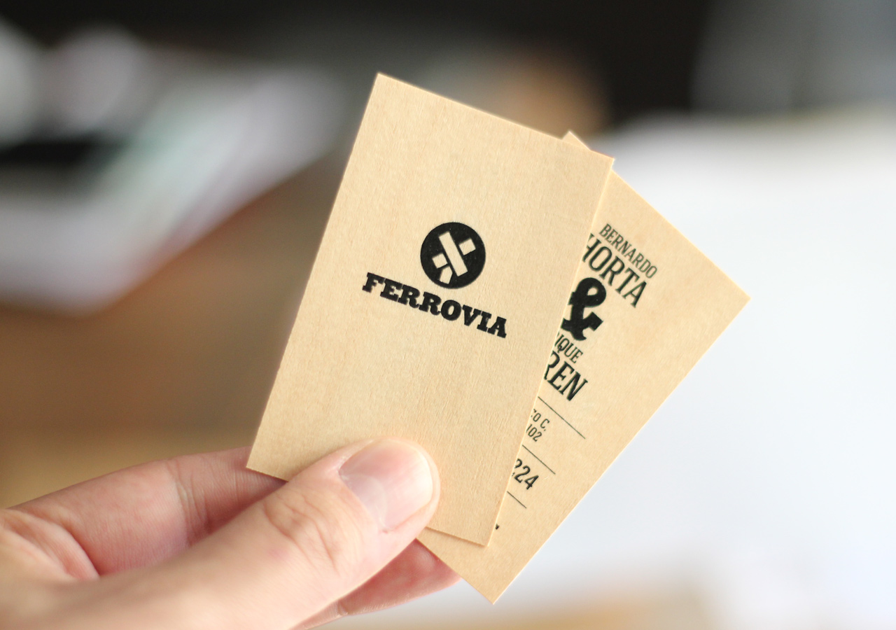
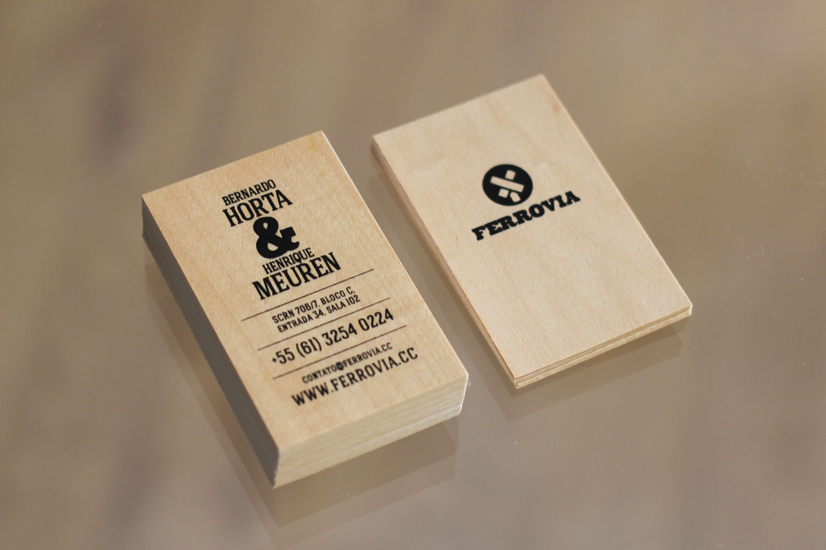
The business card was silk-screened over wood sheets. For a perfect coverage without ink bleeding, two different layers of link were printed. The bottom layer worked as a protection to prevent the top layer from being absorbed by the wood.
We also created an icon set to be used by the studio across multiple medium:
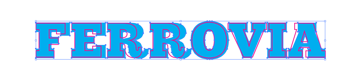
The logotype was based on the ChunkFive font. However, we didn’t think the stock font was bold enough for the logo. It was lacking personality and stength for the visual impact we were aiming for. For that reason, we completely changed every single character. We even adjusted the way the O bottom and the R leg descends below the baseline. The angles of the letters V and A were also adjusted. The slab serifs were made stronger as well.
On the image below you can see the original ChunkFive font in red, and the final version in blue, changed by our team.
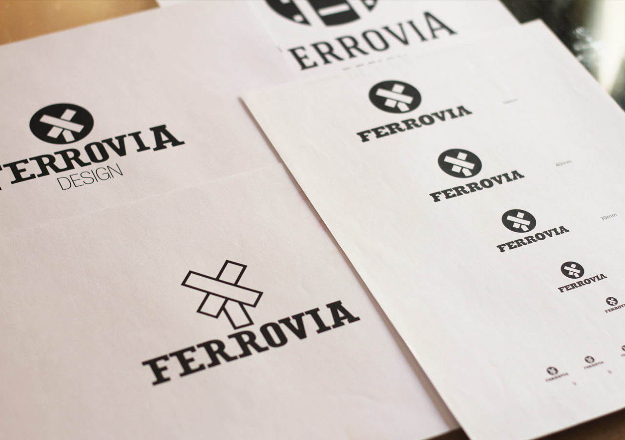
The image below show some early design studies. It’s possible to see some typographic studies and some variations of the symbol.
On the right is possible to see the reduction tests that were made to make sure the logo would be visible even on small applications.
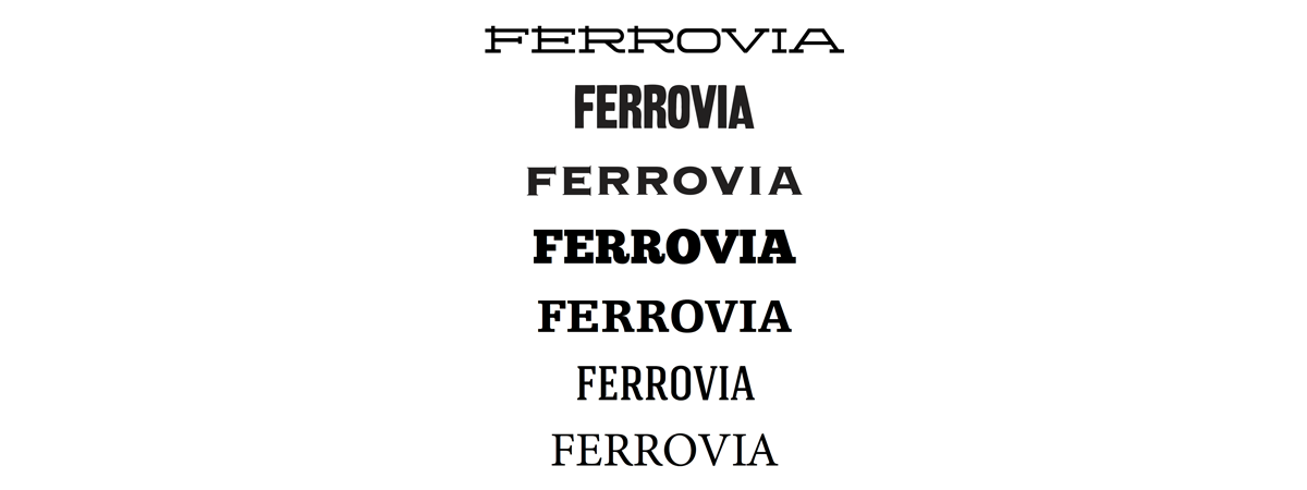
Typographic studies:
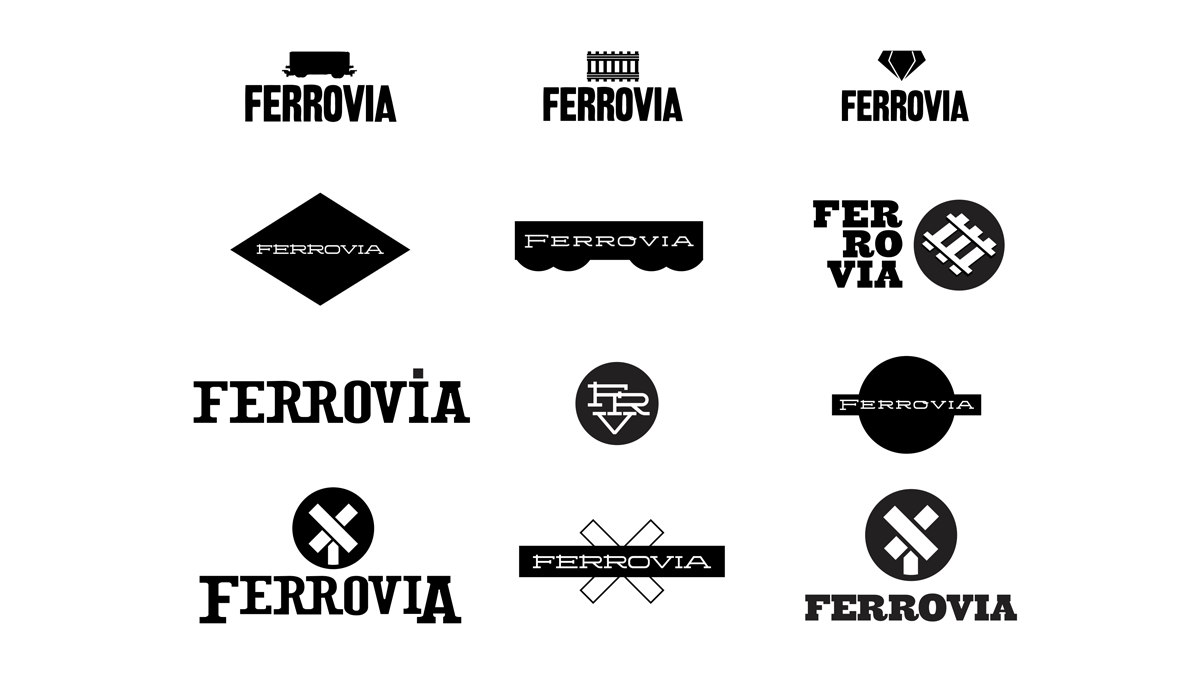
Logo generation exercies:
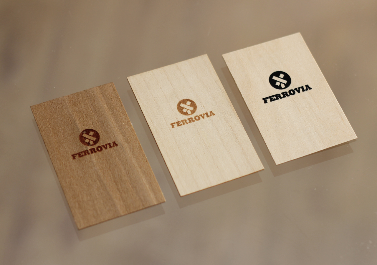
Before deciding to use silk screen, we tested laser engraving the business cards. However, finding the perfect balance between wood resistance and color, laser type and laser temperature proved to be a huge challenge.
Below it’s possible to see two laser engraving attempts on the left, and the final card, silk screened, on the right.