Dalí
How we helped a luxury travel agency provide travellers the best experience for their trips.
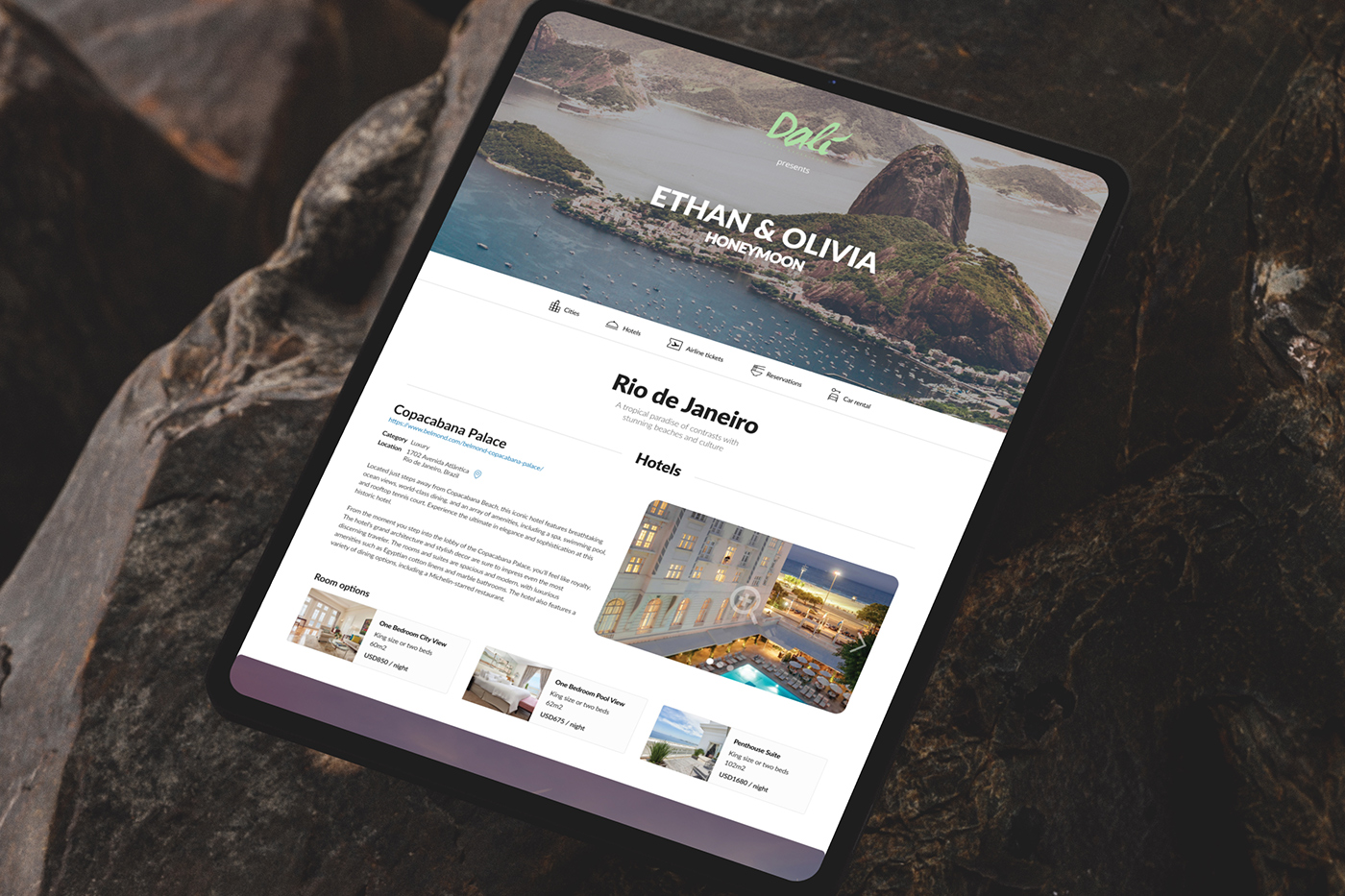
A personalized micro-site for each client, for each trip, with everything they need to view and adjust their journey before, during, and after.
01The challenge
Planning a dream trip meant too many trips to the agency.
When booking a trip, many people will go to a travel agency in person. With the assistance of an agent, they will build the trip of their dreams.
That also puts a burden on travel agents, who have to work hard and dedicate a lot of time to meeting and talking with potential clients, and only a percentage of them close the deal.
Behind the scenes, every proposal was built by hand. City write-ups, hotel descriptions, and photos lived in separate documents and spreadsheets; flight fares had to be requested and copied in one by one; and everything was assembled into a static PDF. Putting a single proposal together could take an agent a couple of days, and every change request meant redoing part of that work, and often another visit to the agency.
Since Dali Travel offers luxury experience travels, they wanted to offer a better service for their clients, so they looked for me to help.
It usually meant the traveler had to visit the agency many times, to view the proposal, adjust the itinerary, and pay.
02The solution
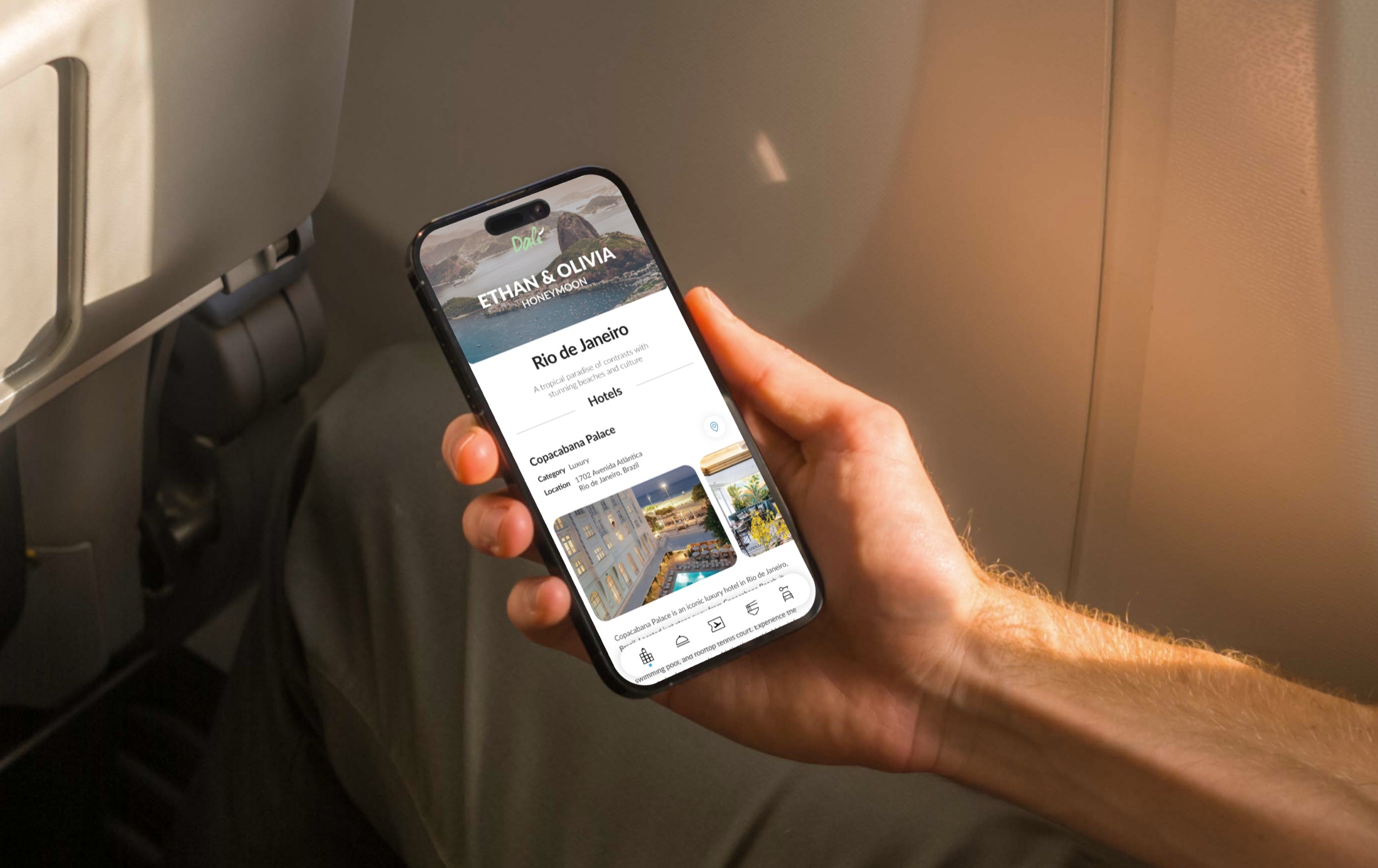
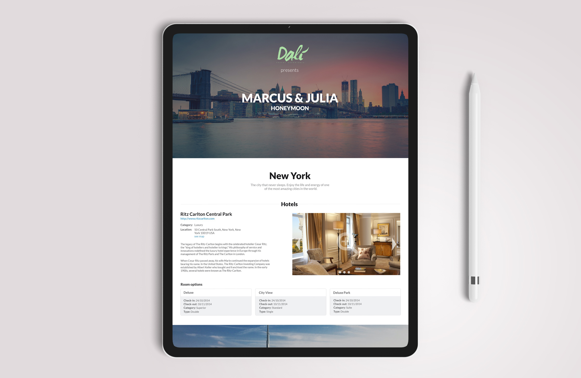
We created a personalized micro-site for each client, for each trip.
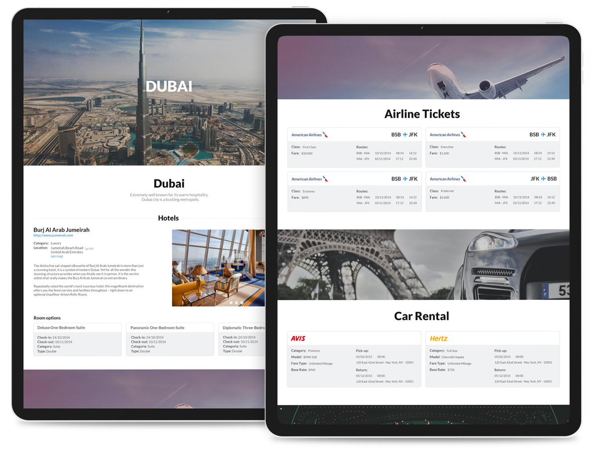
There, the user would have the ability to view the itinerary and hotel room photos, make changes autonomously, mix & match items like rooms and flight tickets, see maps and vouchers, make and manage reservations, and more, all with a friendly interface to help the decision-making process.
From the travel agency perspective, it would allow agents to auto-generate proposals pulling information from data sources. Content that used to live in scattered files became a library the system draws from: when an agent selects a city, the available hotels come in with photos and descriptions ready to drop into the proposal, and an integration with airline ticketing systems pulls in current flight options and fares. It also let agents create templates that could be replicated for different users while remaining easily customizable, and opened the opportunity for the agency to partner with restaurants, car rental companies and hotels.
For the traveler, the closed PDF gave way to a link: a responsive micro-site that works just as well on a phone or tablet as on a desktop, always shows the latest version of the trip, and can be shared with travel companions in one tap.
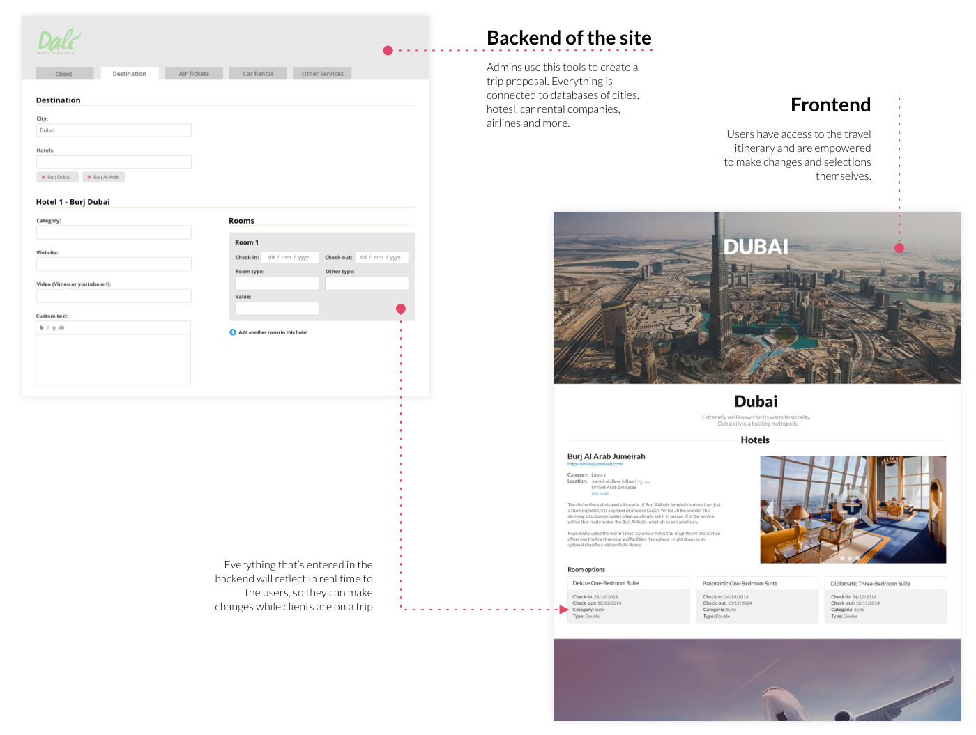
The product is the visible half. From here on, this page shows how we got there, step by step, artifact by artifact.
03Discovery
We started by watching people plan real trips.
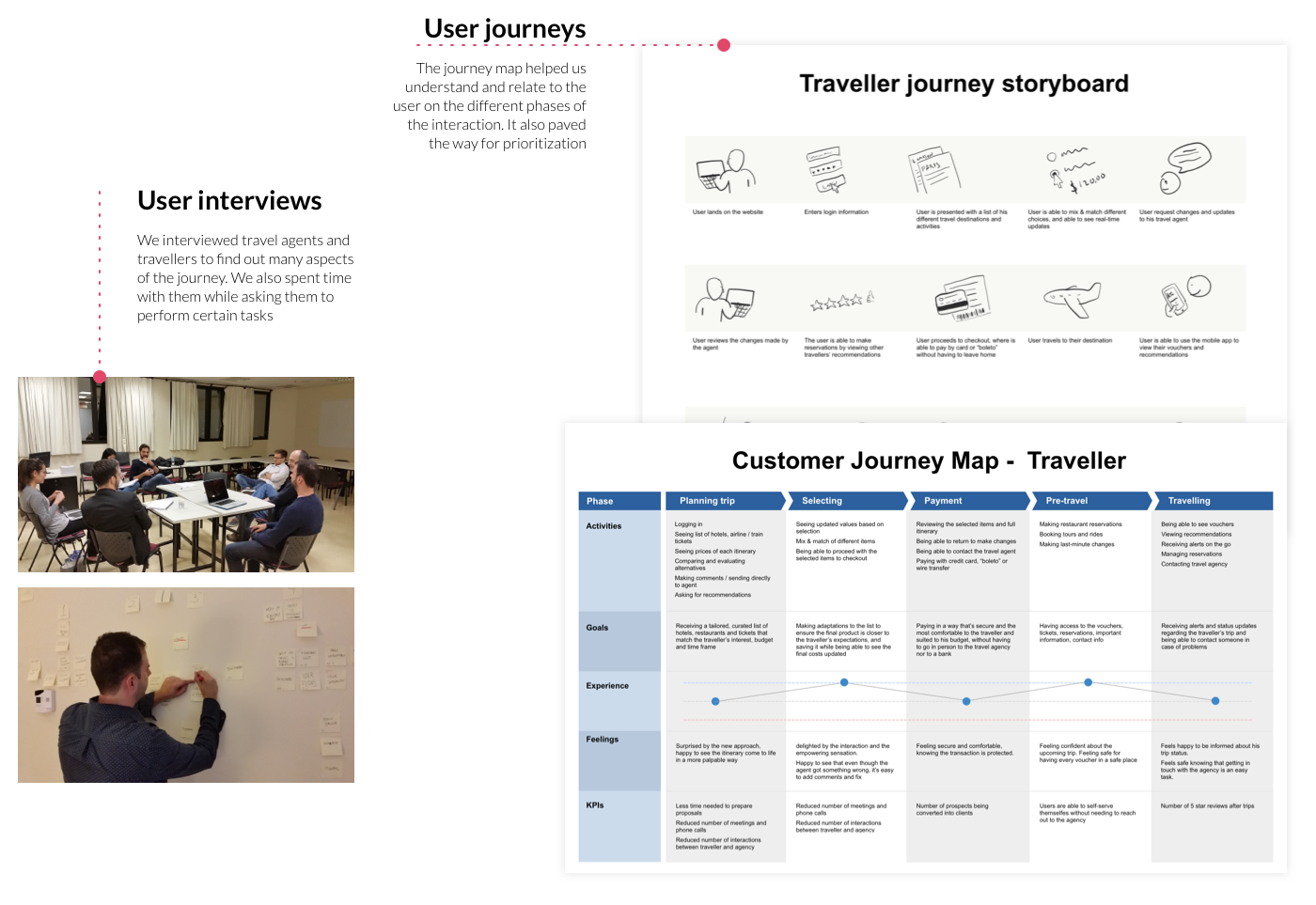
We interviewed travel agents and travellers to understand every side of the journey, and we sat with them while they performed real tasks: assembling a proposal, comparing hotels, requesting a change. Watching the work beat asking about the work: the friction showed up in places nobody thought to mention.
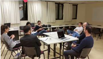
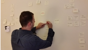
Interview sessions and affinity mapping, clustering what we heard into themes.
The sessions produced a long list of pain points. Written next to each one is the answer that eventually made it into the product, which is how we later argued about what deserved to be built.
Traveller
Travel agent
04Problem definition
One problem, four root causes.
Asking "why" until the answers stopped changing pointed to four root causes:
- 01 Trip content lived in static, disconnected files, so every proposal was rebuilt by hand instead of assembled from a source.
- 02 Traveller and agent had no shared medium: the only interfaces between them were meetings, calls, and email attachments.
- 03 Payment was welded to physical presence, which turned the final "yes" into one more errand.
- 04 After purchase the relationship went dark: no live channel for vouchers, updates, or help mid-trip.
05Hypotheses
What we believed, written down so it could be wrong.
06How might we
The questions that opened the solution space.
With the team and the agency in the room, we turned each root cause into "how might we" questions. They set the brief for ideation without prescribing any answer.
07Ideation
Four concepts entered. One left.
Open idea sessions with designers, developers, agency staff, and travellers generated the raw material: dozens of feature cards, from mapping with points of interest to QR code readers. At the concept level, four directions competed:
Automated PDF generator
Faster to produce, but still a static document: every change would still mean a new file and a new email thread.
Email digest with links
Cheap to build, but it fragmented the trip across messages and gave the traveller nothing to own or return to.
A live micro-site per client, per trip
One address holding the whole trip: itinerary, options, comments, checkout, and vouchers. Always current, shared by traveller and agent.
Full native app
Right instinct, wrong moment: the install barrier would fight adoption. A responsive web experience covered the trip; the app idea waited.
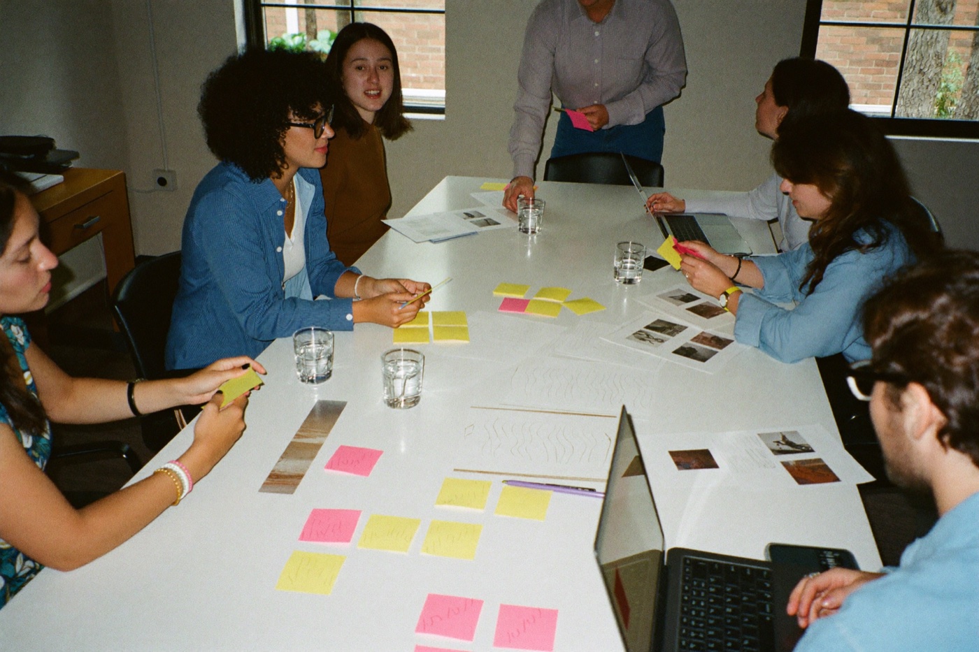
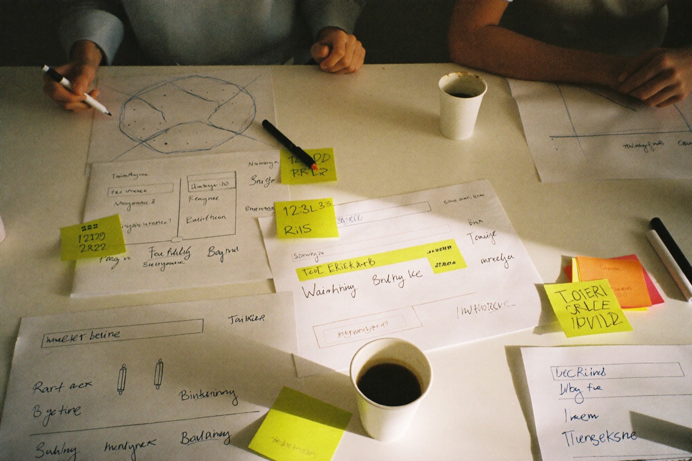
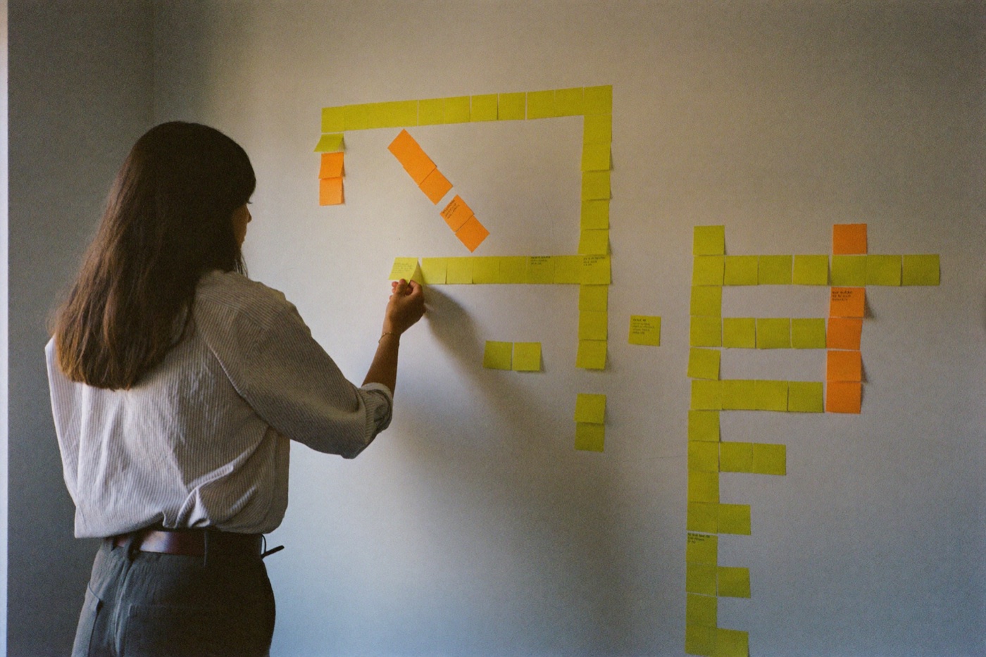
Ideation sessions: feature ideas written as cards, sketched, discussed, and clustered by the whole team.
By the end of a session the wall looked like this: one idea per note, no filtering yet, the good and the doomed side by side.
A reconstruction of the wall. Two of these, the QR reader and buying tickets in the proposal, did not survive the matrix.
Inside the chosen direction, every feature was written as its own card. This is the full inventory that came out of the sessions, including the ones we argued for and then let go.
Trip site & itinerary
- BuiltPersonalized cover with the travellers' names and trip type
- BuiltOne micro-site per client, per trip
- BuiltCity pages with hero image, name, and description
- BuiltItinerary organized by city and dates
- BuiltCity photos and embedded videos
- BuiltTravel tips per destination
- BuiltMap with points of interest
- CutWeather forecast per city
- CutBuilt-in currency converter
Hotels
- BuiltHotel content surfaced automatically from the content base
- BuiltCategory, location, and link to the hotel's own site
- BuiltEditorial description written by the agent
- BuiltPhoto carousel with arrows and position dots
- BuiltLightbox for full-size photos
- BuiltRoom options as comparable cards with dates and type
- BuiltSee map link for each hotel
- BuiltAmenities as icons
- BuiltHotel videos
- LaterRatings and reviews pulled from travel sites
- CutBooking the room directly from the proposal
- CutReviews written by other Dali travellers
- CutSide-by-side comparison of two hotels
Flights, cars & transfers
- BuiltAir tickets with airline, logo, class, and fare
- BuiltMulti-leg routes with dates, times, and duration
- BuiltCar rental with model, rate, period, pickup and drop-off
- BuiltTrain tickets
- BuiltLive fares listed from the ticketing integration
- LaterTransfers and chauffeur service
- CutBuying the airline ticket directly in the proposal
- CutRenting the car directly in the proposal
- CutSeat selection
Experiences & extras
- BuiltOther services block for anything outside the standard types
- BuiltAttractions and tours as itinerary items
- LaterRestaurant reservations
- LaterBooking attractions and concerts
- CutTicket QR code reader at the destination
Deciding & collaborating
- BuiltMix & match of hotels, rooms, flights, and cars
- BuiltTotals updating live with each choice
- BuiltTravellers set their own preferences and selections
- BuiltComments sent straight to the travel agent
- BuiltAgent edits reflected on the live site in real time
- BuiltSharing the trip with co-travellers
- LaterUpvoting and favoriting items to signal preference
- CutPublic social sharing of the itinerary
- CutAgency recommendations engine
Checkout
- BuiltReview of every selected item and the full itinerary
- BuiltPaying online by card, boleto, or wire transfer
- BuiltReturning to adjust choices before paying
- BuiltConfirmation and receipts
- LaterInstallments
- CutSplitting payment between travellers
During the trip
- BuiltVouchers and reservations in the traveller's pocket
- BuiltResponsive access from phone and tablet
- BuiltReal-time updates while the trip is happening
- BuiltEmergency numbers and agency contact
- LaterNative app with push notifications
- LaterOffline access to vouchers
Agent tools (backend)
- BuiltProposal builder split by Client, Destination, Air Tickets, Car Rental, and Other Services
- BuiltClient selector, trip title, and estimate date
- BuiltRich text editor for custom copy in every block
- BuiltImage upload and ordering per city, hotel, and room
- BuiltVideo embedding by URL
- BuiltRepeatable blocks: another room, another hotel, another ticket
- BuiltAuto-complete for hotel and city names
- BuiltTemplates replicated across clients
- BuiltPublishing changes to the live trip site instantly
- BuiltPassword login and access control per trip
- LaterReading which items the client opened and compared
Content base
- BuiltReusable database of cities, with copy, photos, and videos
- BuiltReusable database of hotels, rooms, and amenities
- BuiltDatabase of airlines and car rental companies with logos
- BuiltContent written once and reused across proposals
- LaterPartner-managed content, kept current by hotels themselves
Several of those features only work if something feeds them. The integrations were part of the same conversation, since they decide what an agent has to type and what arrives on its own.
08Prioritization
Every card earned its place on the matrix.
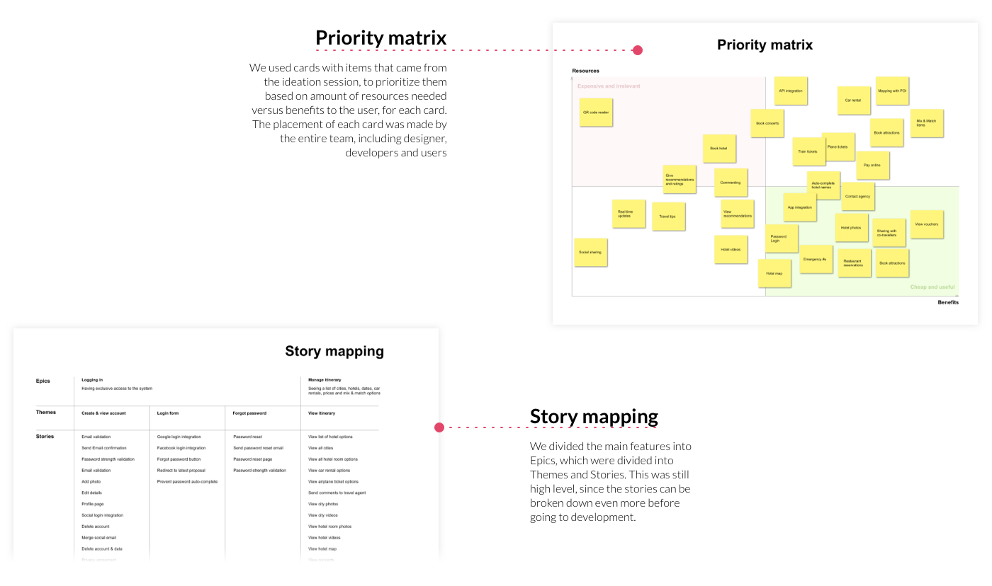
Each idea card from the sessions was placed on a priority matrix of resources needed versus benefit to the user. The placement was done by the entire team, designers, developers, and users together, so the trade-offs were argued in the open. Cards in the "cheap and useful" corner, like online payment, vouchers, and mix & match, shaped the MVP; the "expensive and irrelevant" corner, like QR code readers, was let go without guilt.
The matrix redrawn with the cards that decided the MVP. Everything in the green corner shipped first; the lonely card in the red corner did not ship at all.
09Story mapping
From themes to epics to stories.
The prioritized features were organized into a story map: themes on top, epics under them, and user stories below, still high level on purpose, since stories break down further before development. A condensed view:
Redrawn from the original board, which carried every story with its acceptance notes.
10Personas
Three people we designed for.
The interviews condensed into three personas: two travellers with opposite relationships to time, and the agent, who is a user of the same system from the other side.
Helena & Marcos
Planning the trip of their lives and enjoying the planning almost as much as the trip.
Goals
- See and feel the trip before paying
- Compare hotels and experiences together, at home
Frustrations
- Deciding from a flat PDF with no photos of the actual rooms
- Hunting hotel pictures and locations on other sites, one tab at a time
- No easy way to look at it together, or send it to family
- Waiting days for each revised version
"We want to dream it together before we buy it."
Ricardo
Travels often, decides fast, and has no patience for errands that could be a link.
Goals
- Approve and pay in minutes, remotely
- Have every voucher on his phone mid-trip
Frustrations
- Flights in one file, hotels in another, the car in a third
- Comparing two configurations and their totals took a spreadsheet
- Going to the agency to pay
- Printed folders of travel documents
"If it needs a meeting, it's already too slow."
Sofia
Knows the destinations by heart, but spends her days copying content between files.
Goals
- Assemble proposals from ready content
- Reuse templates and answer changes fast
Frustrations
- Rebuilding PDFs after every change
- Copying descriptions and photos from hotel websites
- No signal about whether the client even opened the proposal
- Being a typist instead of a curator
"I sell journeys. I shouldn't be formatting documents."
11The traveller journey
First a storyboard, then the map.
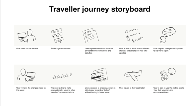
Before mapping anything into rows and columns, we drew the journey as a storyboard, ten scenes from landing on the site to using vouchers at the destination. It made the experience easy to feel, and it paved the way for the structured map and for prioritization.
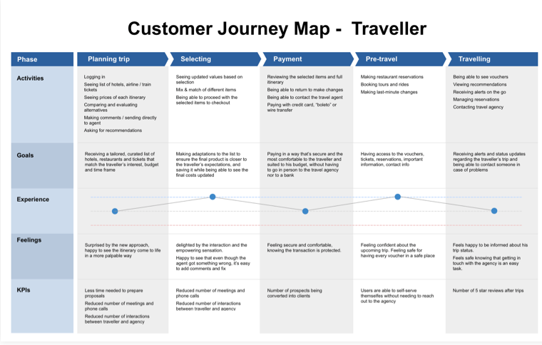
The full customer journey map covers the whole relationship, from researching a destination to coming back home. For each phase: what the traveller does, what they want, how it feels, and how we measure it.
- Browsing destinations and dates
- Collecting references and wishes
- Setting a budget range
- Logging in to the trip site
- Seeing hotels, flights, and train tickets
- Comparing itinerary prices
- Commenting and asking for recommendations
- Mix & match of hotels, cars, and flights
- Seeing values update with each choice
- Returning to adjust choices
- Proceeding to checkout
- Reviewing items and full itinerary
- Contacting the agent if needed
- Paying by card, boleto, or wire transfer
- Making restaurant reservations
- Booking tours and rides
- Last-minute changes
- Opening vouchers on the go
- Viewing recommendations
- Receiving alerts
- Contacting the agency
- Reviewing the trip
- Sharing photos and impressions
- Starting to dream about the next one
Extended from the original artifact below; the map continues past the edge of the page.
12Flows & architecture
How the screens connect.
The user flow follows the journey: enter, explore, decide, pay, travel. Solid boxes are screens; dashed ones are views inside a screen.
Access
Trip home
Explore
Decide
Pay
Travel
The information architecture keeps the trip as the center of gravity: everything hangs off the client's current proposal.
13Validation
Tested with the people who would live in it.
Wireframes were presented to users and to developers, and adjusted to match what users expected to see and what the team could build. During that phase, we made sure that every single requirement was captured by the mockups.
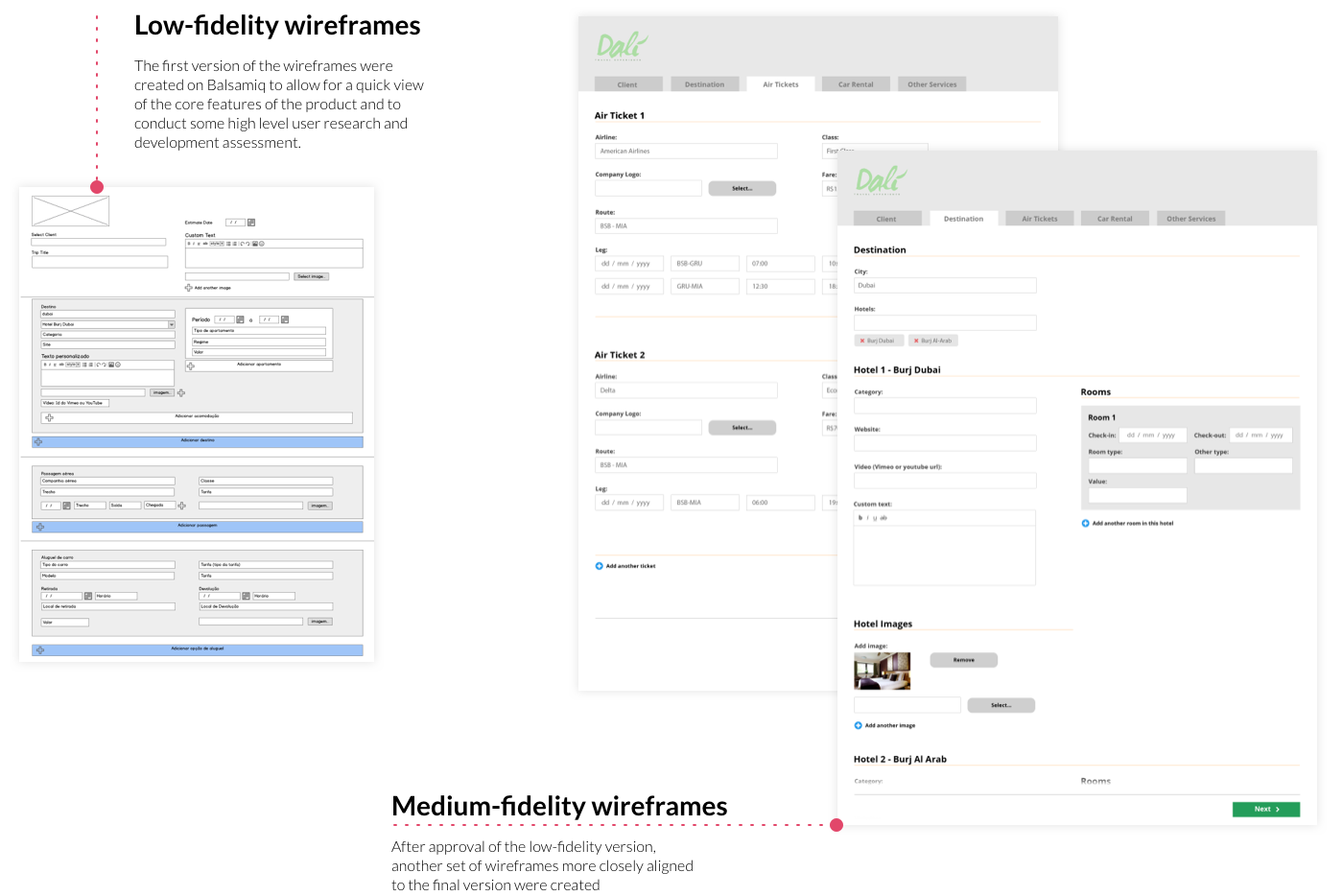
The clickable prototype then went through acceptance rounds: travellers and agents performing the real tasks, find a hotel, swap it, comment, check out, with us watching where they hesitated.
The rounds trimmed the design rather than reinventing it: labels renamed to the travellers' own words, the mix & match tray made permanently visible, and the checkout reduced to fewer, calmer steps. When the tasks stopped generating questions, the design was ready for the pixel-perfect handoff.
14Development handoff
A 30-page spec so the build matched the design.
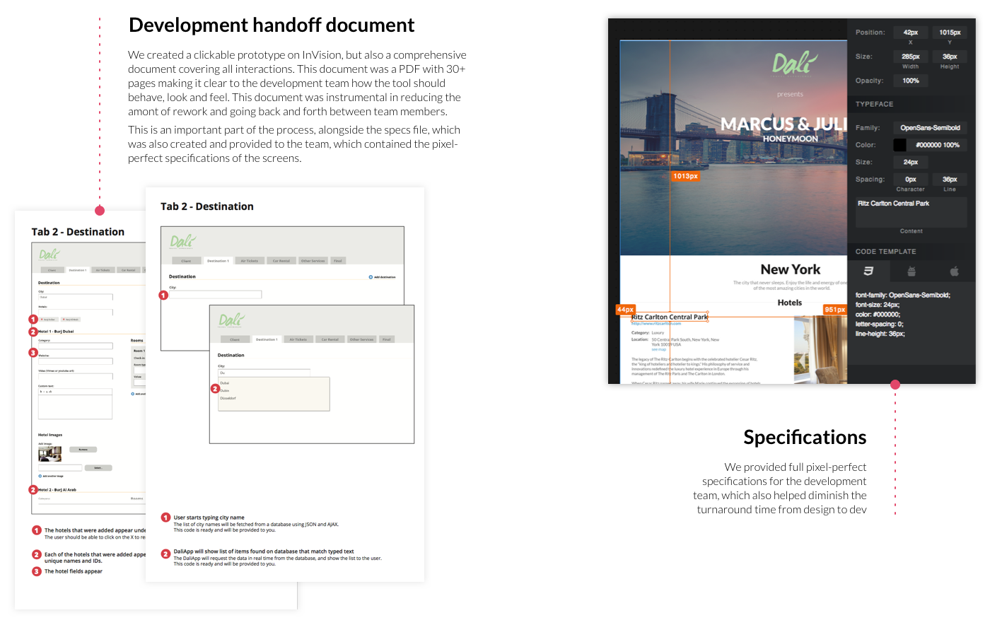
We created a clickable prototype on InVision, but also a detailed document covering all interactions, a PDF with 30+ pages making it clear to the development team how the tool should behave, look and feel. This was instrumental in reducing rework and back-and-forth between team members.
This is an important part of the process, alongside the specs file, also created and provided to the team, which contained the pixel-perfect specifications of the screens.
15Results & conclusion
A streamlined experience for travelers and agents alike.
The biggest shift was in the agents' time. A proposal that used to take around two days of manual assembly, hunting content across documents and spreadsheets, requesting fares, and laying out a PDF, can now be put together in about an hour, with cities, hotels, and live flight options pre-loaded in the system. Revisions that used to mean redoing the document and booking another meeting became same-day adjustments the client sees instantly.
Travelers got a better deal too: instead of a static PDF that aged with every change, they can open the latest version of their trip anywhere, on any device, share it with companions, and adjust it on their own.
Dali Travel's emphasis on customer satisfaction and innovative features set it apart from traditional travel-planning tools, one that caters to the modern traveler's needs and preferences.
Nothing here was decorative. Every artifact earned a decision.