Knowledge Suite
Helping 200.000+ employees find the right materials at the right time.
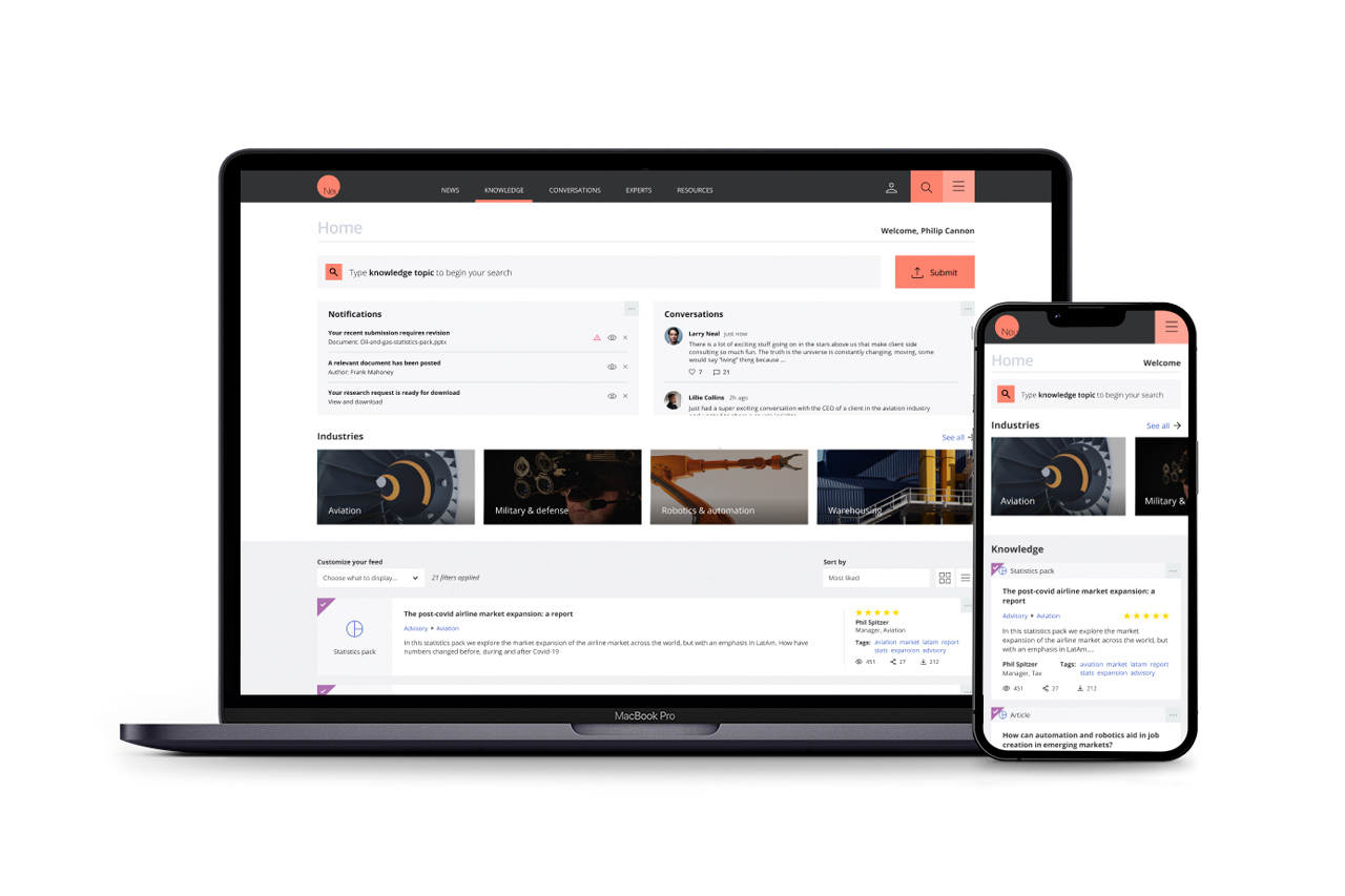
In this challenge, I helped turn a 6-month engagement into a 5-year partnership with one of the largest consulting firms in the world.
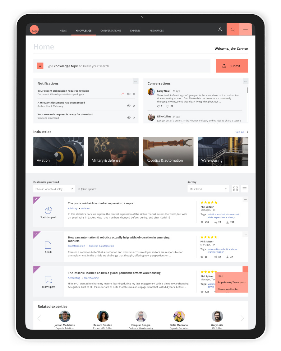
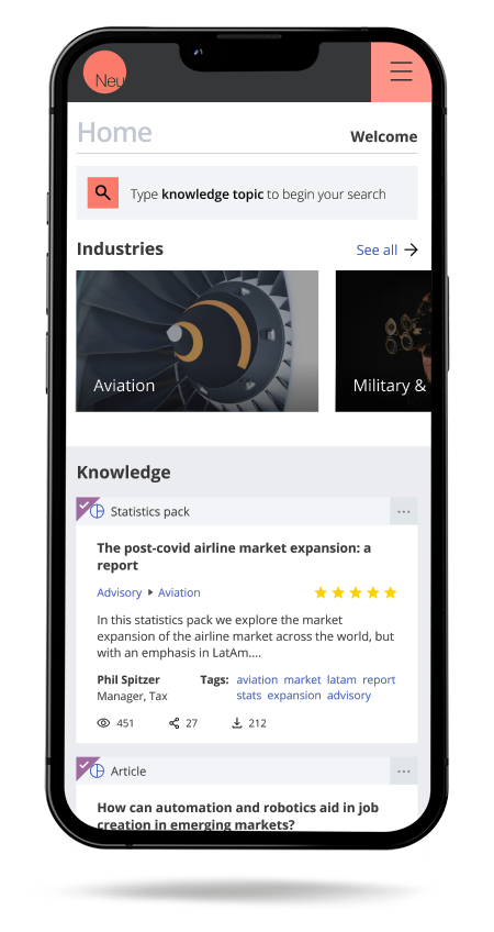
My team was invited to design the experience and interface for a set of digital tools in the knowledge ecosystem of a large professional services firm.
As part of the product team, our job was to build a place that got employees and collaborators sharing knowledge, on a platform they could trust to keep that information secure.
I was the design lead for the project, which included four different tools:
Search site: a dashboard that presents recommended, high-value content related to a user's needs, interests, and preferences.
Practice pages: destinations for the company's Service Lines and Sector organizations, acting as an authoritative source for information.
Community sites: networks where subject-matter experts can connect and discuss topics, so knowledge gets shared across the firm.
Submission form: efficient content sharing by allowing users to publish content displayed in multiple locations across the platform.
01
Results
We designed a unified platform for the firm's knowledge sites. It landed well, with strong adoption, and led to a contract extension and a future redesign.
02
The solution
The knowledge suite included the Search portal, Service Line websites, Communities, and Profiles, all mobile-enabled and all accessible from the main portal.
One of the main objectives was not only to allow users to search and browse for content but to encourage and facilitate knowledge submission. So the main portal should be a one-stop shop for finding and submitting content.
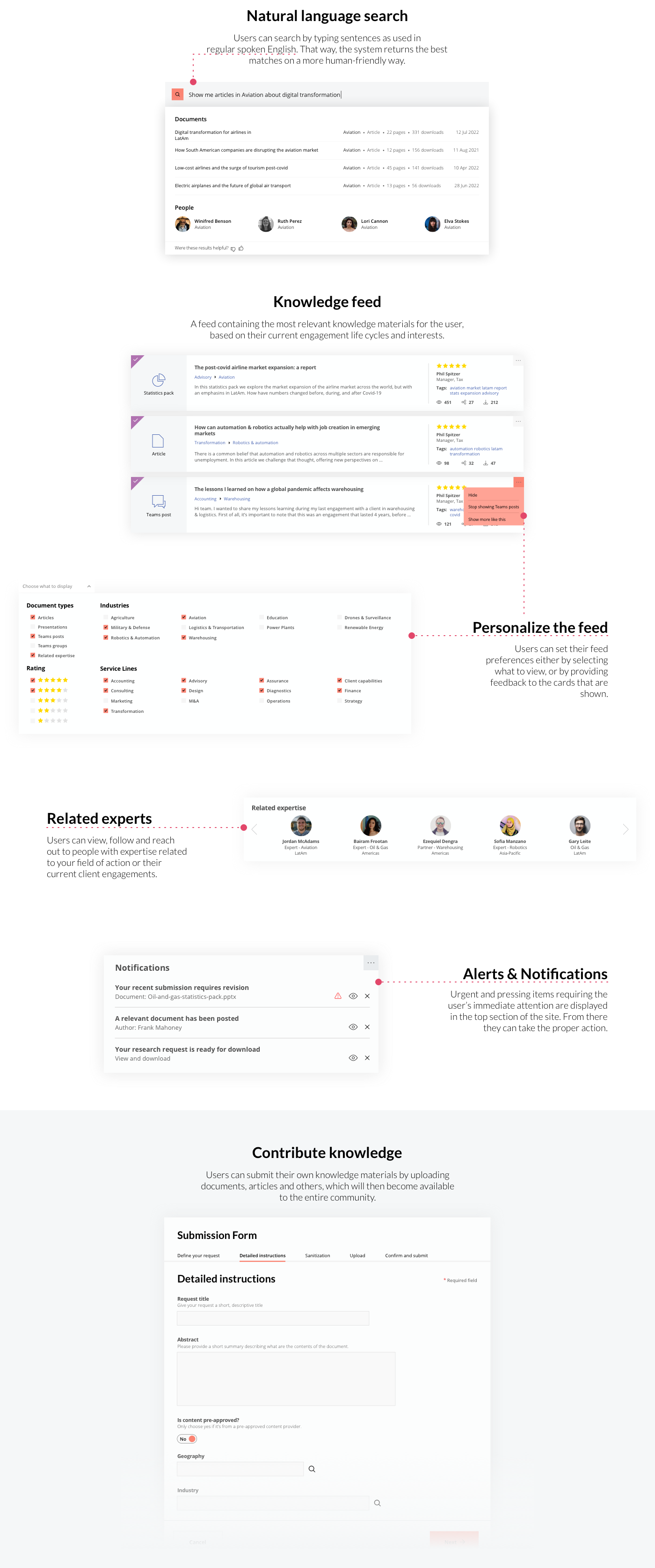
The main portal should be a one-stop shop for finding and submitting content.
03
Personas, journey maps, and a hard look at the competition.
The initial stage kicked off by addressing various key elements, including establishing the project vision, user profiles, defining roles and responsibilities, outlining the project plan, determining scope, identifying dependencies, discussing risks, and setting acceptance criteria. These aspects ensured that our team was well aligned and prepared for the challenges ahead.
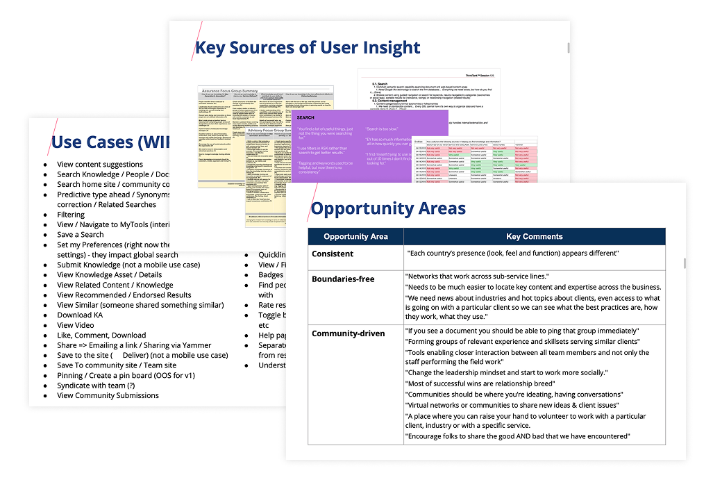
The following step was to begin the process of identifying specific business, design, and technical challenges to address, as well as understanding the current user experience, issues identified by the business, any user feedback from surveys, usage metrics, and user behavior patterns.
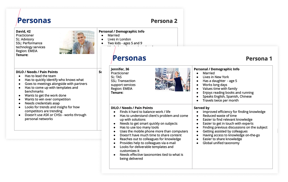
To get everyone on the same page, I created personas, a high-level information architecture, and user journey maps, and planned out the design work.
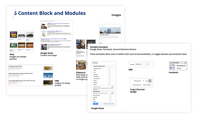
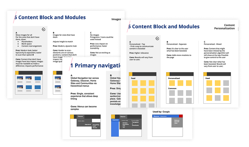
I also ran a competitive analysis, looking at industry leaders and similar platforms to spot good patterns, common mistakes, and room to stand out. That helped us decide what to adopt, refine, or skip.
04
From open idea sessions to testable wireframes.
Our team generated diverse ideas to address challenges and objectives identified in discovery. We held open idea generation sessions, enabling team members to contribute their thoughts and perspectives to inspire creative solutions.
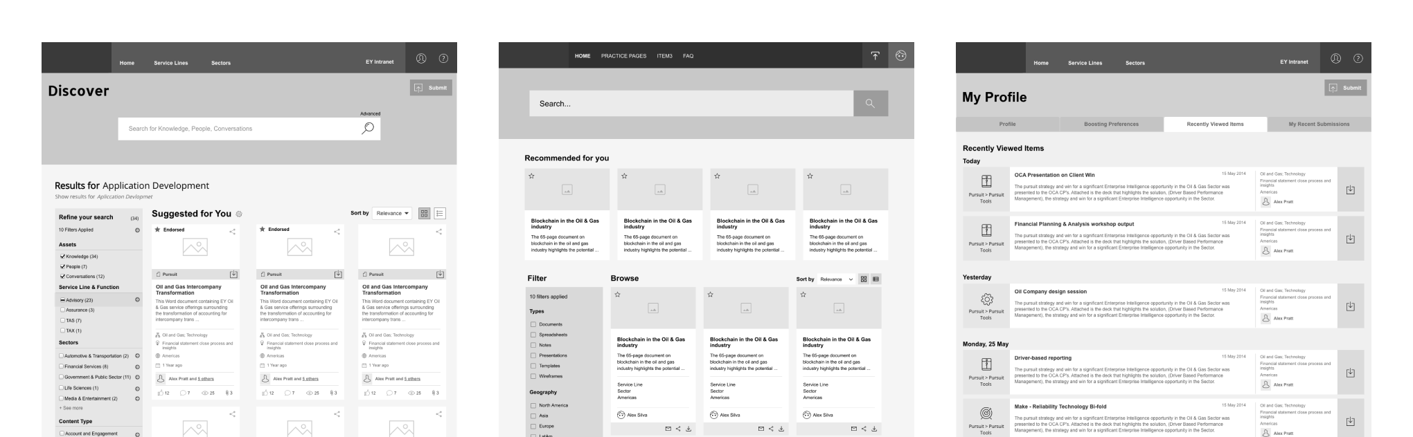
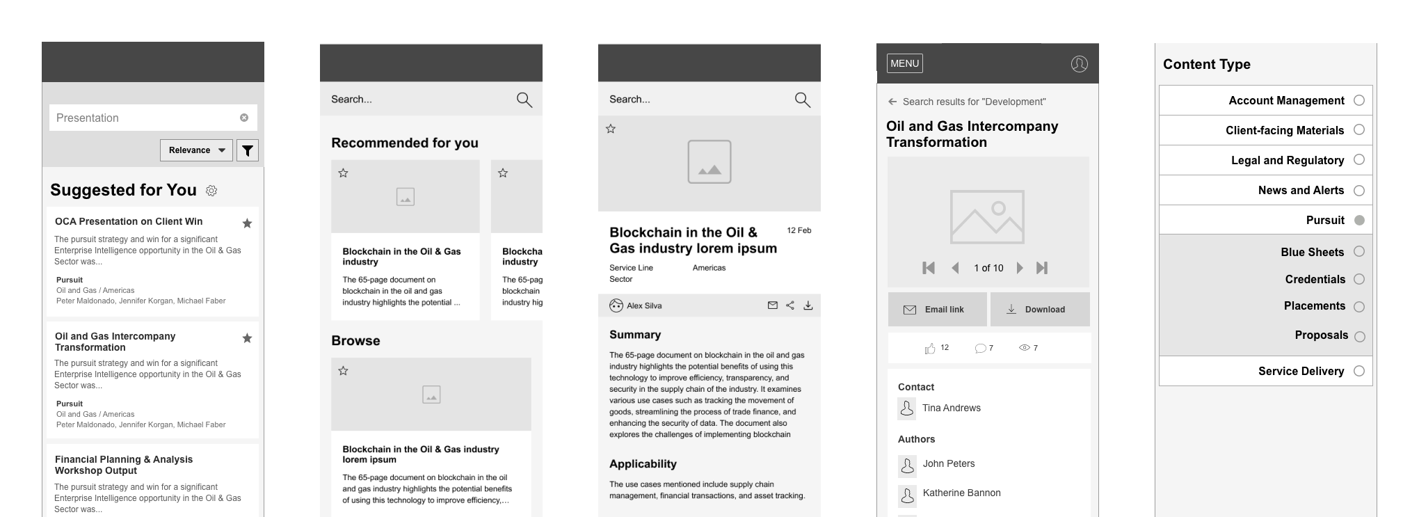
We then ranked those ideas by likely impact, feasibility, and fit with the project goals. That helped us find the strongest concepts, which we translated into low-fidelity wireframes, letting us iterate quickly and gather feedback early.
These blueprints defined the platform's structure and kept it aligned with the requirements. I designed wireframes for desktop and mobile, focused on clear navigation, easy content discovery, and simple knowledge sharing. Early iterations let us gather feedback before moving to high-fidelity prototypes.
05
Prototype, test, refine, repeat.
We developed wireframes that balanced leadership expectations, user needs, and technology capabilities, then transformed them into high-fidelity, clickable prototypes, enabling users to interact with an early product version. By observing interactions and gathering feedback, we identified areas for improvement and refined the user experience before advancing to the final design stage.
We validated and refined those prototypes through user tests and feedback from a diverse group of users, representative of the target audience. Usability testing, A/B testing, and heuristic evaluations surfaced pain points and areas for improvement in an iterative process. Keeping the experience clear and engaging was a big part of why the project worked.
Throughout the entire project, the end of each phase fed into the beginning of the next, which let us adapt and innovate as the needs of the client and its users evolved.
06
A design system with its own documentation site.
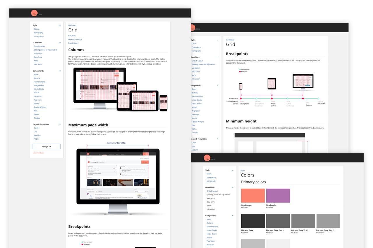
I created the Design System for the Knowledge Suite in Figma and developed a dedicated website where designers and developers could easily navigate and access up-to-date resources.
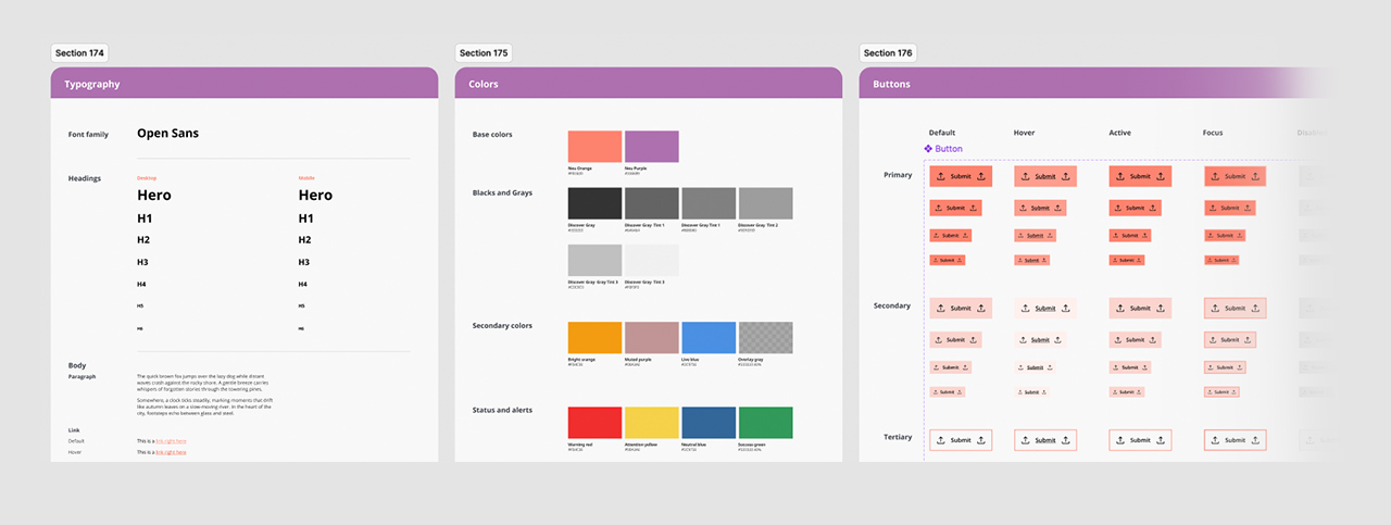
In Figma, I built a full set of components, including states, styles, and icons, so designers could build on our work consistently and quickly.
07
A handoff with no guesswork.
For development handoff, we made the move from design to build as clean as possible: the design system, plus detailed docs on component behavior (microinteractions, animations, states), the core assets like icons, typography, and style guides, and annotated specs for how each element should work. That cut ambiguity and kept the build true to the design.
08
From a six-month engagement to a multi-year partnership.
The project produced an effective knowledge ecosystem, one that made collaboration and information retrieval easier and got people sharing what they knew.
Users adopted it, it moved the needle on the company's productivity, and it opened the door to a multi-year partnership and an ongoing, iterative design relationship.
This project is a good example of what a well-run UX process can do, and I'm proud of the work and its lasting impact on the client.