FitLife
A fitness companion concept that turns daily numbers into something you can act on.
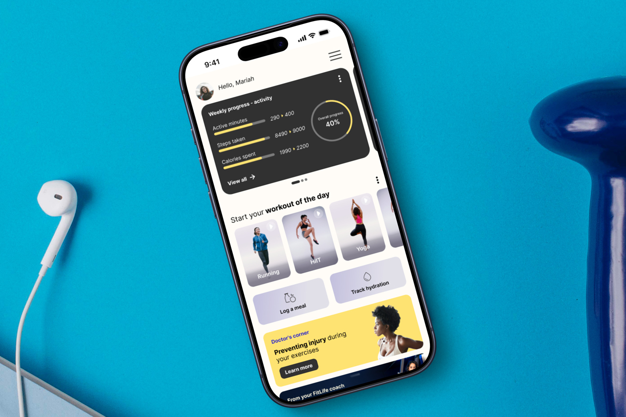
Most fitness apps are good at counting and bad at coaching. FitLife tries to close that gap.
01The challenge
People don't quit tracking. They quit apps that stop helping.
Fitness apps tend to fail in one of two ways. Some bury you in charts until logging feels like a second job. Others cheer so generically that the numbers stop meaning anything. Either way, people leave, not because they stopped caring about their health, but because the app stopped helping them decide what to do next.
FitLife is a concept built around one question: what does a person actually need from a single glance at their phone, on a normal day, between workouts?
Fewer numbers, better framed, beat more charts.
02The solution
One screen, three jobs.
The home screen answers three questions, in order: how am I doing, what should I do now, and who can help me do it better.
Progress comes first, in the only dark block on the screen, so the numbers land before anything else. Each metric shows where you are next to where you set out to be: 290 of 400 active minutes, 8,490 of 9,000 steps, 1,990 of 2,200 calories, with a single ring adding the week up to 40%. Framed that way, a Tuesday at 40% reads as a week in progress, not a failing grade.
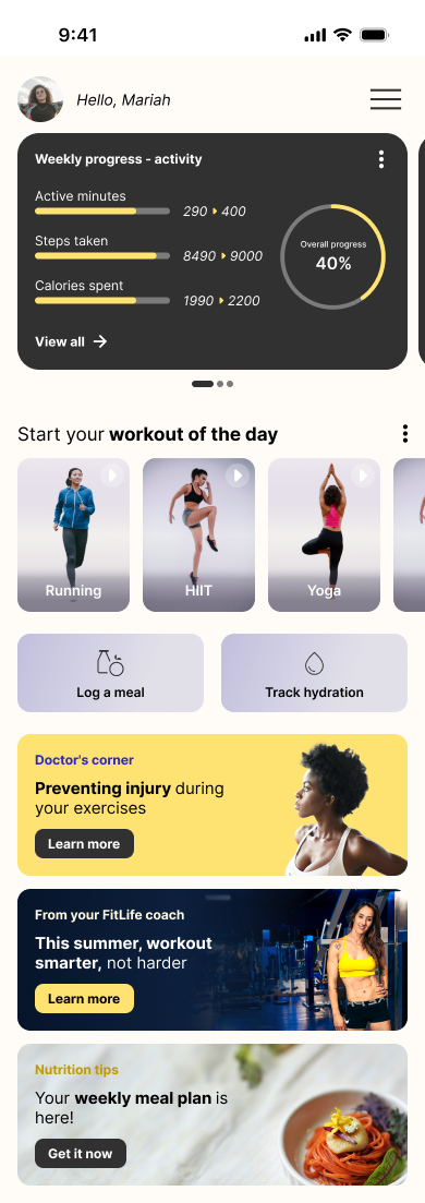
Below the numbers, doing something takes one tap. The workout of the day comes as ready choices, running, HIIT, or yoga, and the two most frequent chores, logging a meal and tracking water, get their own buttons instead of hiding inside menus.
The last stretch of the screen is guidance: a doctor's note on preventing injury, a message from the coach, and the weekly meal plan. Every card is signed by a role, so advice reads as coming from someone, not from a notification engine.
03Design decisions
A hierarchy you can feel before you read it.
The visual language keeps the hierarchy honest: a warm off-white base, one dark card for data, and a single yellow accent that marks progress and calls to action. Type does the rest, bold where a decision happens, regular everywhere else.
The tone is personal by design. The app greets Mariah by name, the targets are hers, and the content cards carry their authors. Small choices, but they are the difference between a tracker and a companion.
04Where it landed
A testbed for an idea I keep bringing to client work.
FitLife ran from early sketches to the high-fidelity prototype shown here. As a self-initiated concept it had no client constraints, which made it a good place to pressure-test a belief that keeps proving itself in product work: people stay with tools that tell them what to do next, not with tools that only tell them what they did.