Caritas
Partnering with a non-profit to help people across the country.
Caritas targets at giving the tools to people to transform their own lives and advocates for a better world for everyone.
Caritas, a global non-profit organization known for its humanitarian and developmental aid, sought to overhaul their online presence in Brazil. The goal was to enhance user interaction, increase donations, and improve transparency and regional autonomy within their digital experience.
This case study outlines the journey from identifying the challenges to implementing a solution that met their complex needs.
The primary challenges identified for the Caritas website redesign were multifaceted:
-
- Raising Awareness: Boosting visibility and understanding of Caritas’ global and local initiatives.
- Increasing Fundraising: Enhancing mechanisms on the website to drive donations and regular support.
- Data Transparency: Providing clear and accessible reports on how donations and resources are utilized.
- Regional Autonomy: Facilitating regional branches of Caritas in Brazil to manage their micro-sites with some degree of customization.
- Campaign Integration: Seamlessly integrating both global and local campaigns, making them accessible to a diverse audience.
The solution
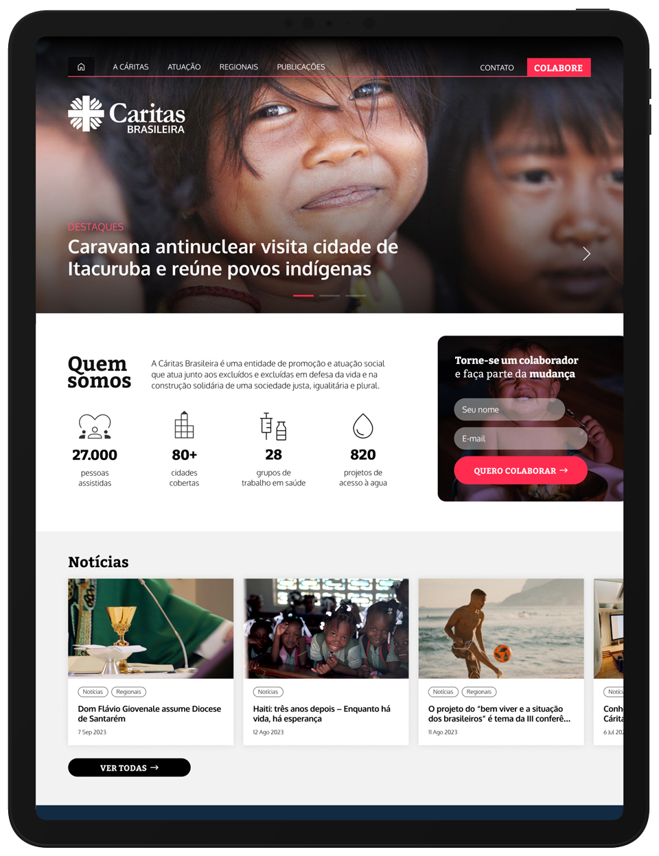
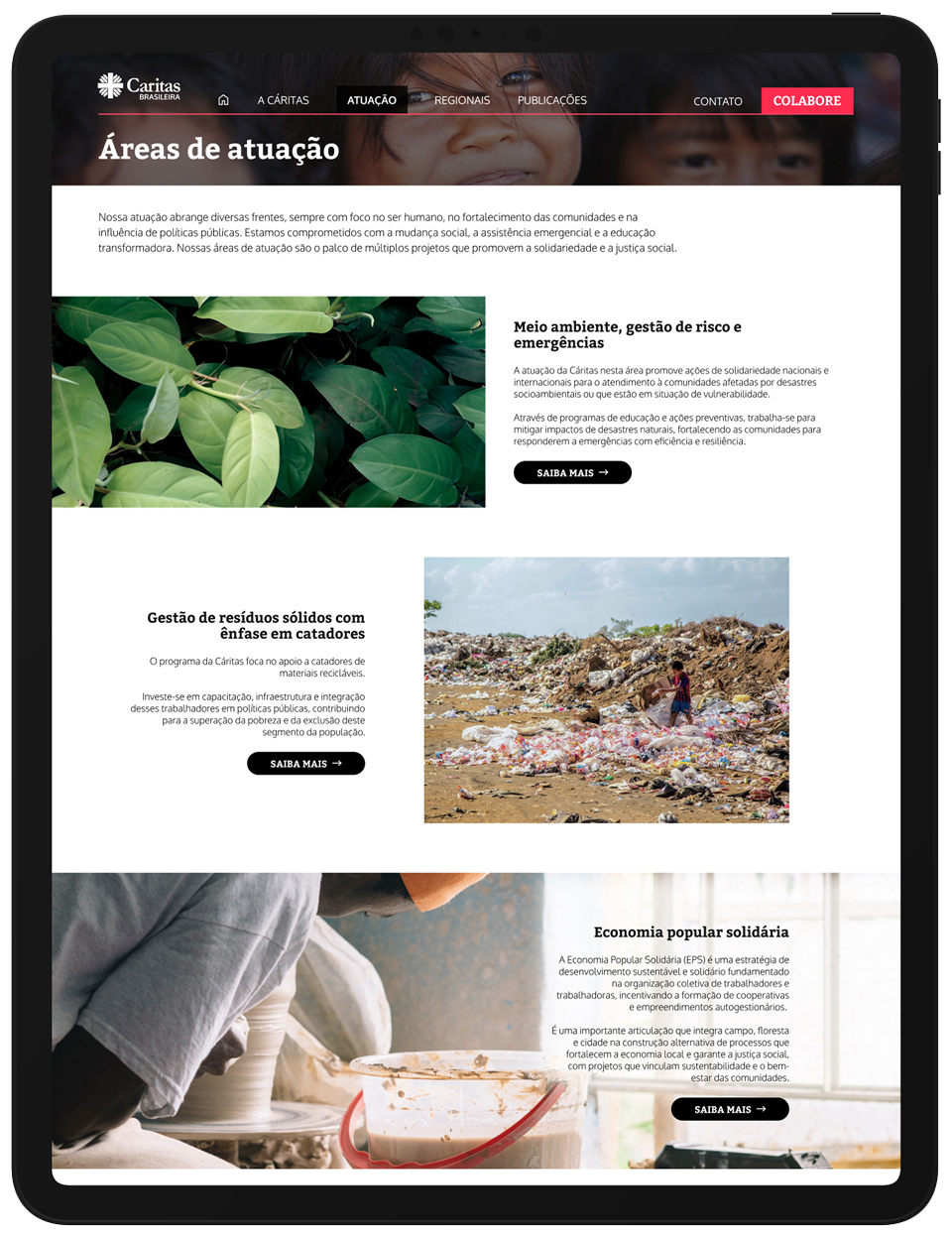
The redesigned Caritas website features a clean and simple interface that makes it straightforward for users to find what they need, whether it’s information about Caritas’ projects, how to donate, or understanding where the money goes.
The redesigned website for Caritas is structured to enhance visibility and understanding of their impactful work worldwide. It aims to facilitate an increase in donations through a user-friendly design that highlights key initiatives and easy-to-access donation buttons. By simplifying the donation process and clearly showcasing the positive outcomes of their projects, the website encourages more people to contribute.
We’ve also introduced a transparent section dedicated to showing exactly how every donation is utilized. This area breaks down expenditures and results, providing a detailed look at the direct impact of contributions, from community development to emergency relief efforts. This level of transparency builds trust and reinforces the importance of every dollar donated.
The overall aesthetics of the site have been refreshed to create a welcoming and engaging environment. With a smart layout that intuitively guides visitors through information about Caritas’ missions and achievements, the website makes it simpler for visitors to find the information they need and take action. Interactive elements and real-time updates ensure that visitors are not only well-informed but also constantly engaged with Caritas’ ongoing efforts and campaigns. This dynamic approach helps keep the community connected and motivated to support Caritas’ cause.
My roles and responsibilities
- Branding and visual design
- Planning
- User journey mapping and creation of epics and stories
- Creation of wireframes and clickable prototypes
- UX and UI Design
- User research planning and facilitation
- Development in PHP, with Maps and openID integrations
- Evaluation of metrics and user feedback
The design process went through the 4 phases:
Discovery
The phase involved researching the organization and its target audience to identify their needs, pain points, and goals. This involved analyzing data from the previous website, conducting user surveys, and studying the websites of similar non-profit organizations. The research findings were used to create user personas, which helped to understand the needs and behaviors of Caritas’ audience. The discovery phase helped to identify the main issues that needed to be addressed in the website redesign. We learned that donors and users value transparency, accountability, and simplicity in the donation process. They also want to know how their donations are being used, understand the mission and values of Caritas, and be engaged with the organization
Ideation
The ideation phase involved brainstorming and generating ideas for the website design based on the research findings. The team came up with several design concepts and user flows that addressed the identified issues, including a simplified donation process, increased transparency, and storytelling. Sketches and wireframes were created to visualize the design concepts and explore different layout and navigation options. Feedback from stakeholders and users was gathered and used to refine the design concepts and select the most promising ones.
Prototyping
In the prototyping phase, the design concepts were turned into interactive prototypes that could be tested and refined. High-fidelity mockups were created using design tools such as Sketch, and interactive prototypes were built using tools like InVision. The prototypes were tested with users to gather feedback on the user interface, user experience, and functionality. Changes were made based on user feedback, and the prototypes were iterated until they met the needs of both the users and the stakeholders.
Testing
The final phase of the design process was testing, which involved conducting usability tests and user acceptance tests to ensure that the website met the needs of the users and the organization. The website was tested with a diverse group of users, including those with different levels of technical proficiency and different demographics. Feedback was gathered and used to refine the design and fix any usability issues. The website was also tested with stakeholders to ensure that it met the organization’s goals and objectives. The testing phase helped to ensure that the website was user-friendly, effective, and aligned with the organization’s mission and values.
Results
The Caritas website redesign was successful, resulting in a significant increase in donations and engagement. The new design included clear calls to action, simplified donation process, increased transparency, storytelling, and social proof, which helped to build trust and understanding among users. The user-friendly interface and engaging content also helped to build trust and credibility with Caritas’ audience.
The improvements were substantial, with donations via site increasing by 14% and the number of new donors by 21% within the first year of launching the new website. Additionally, the website saw a 42% increase in traffic and a 30% decrease in bounce rate. These impressive results demonstrate the effectiveness of the new design in better reaching Caritas’ audience and achieving its goals.
Due to the success of the website redesign, Caritas and I formed a long-term partnership, creating additional sites such as regional sites and promotional campaigns. This collaboration has resulted in even more significant improvements in donations and engagement, helping Caritas to provide essential humanitarian services to those in need.